Case study

It was clear that SIMPLY had a lot to offer—savings, stability, and clarity. However, the old website presentation didn't communicate this clearly or effectively. Today's users expect simplicity, reliability, and quick navigation. The original site was too technical and failed to drive action.
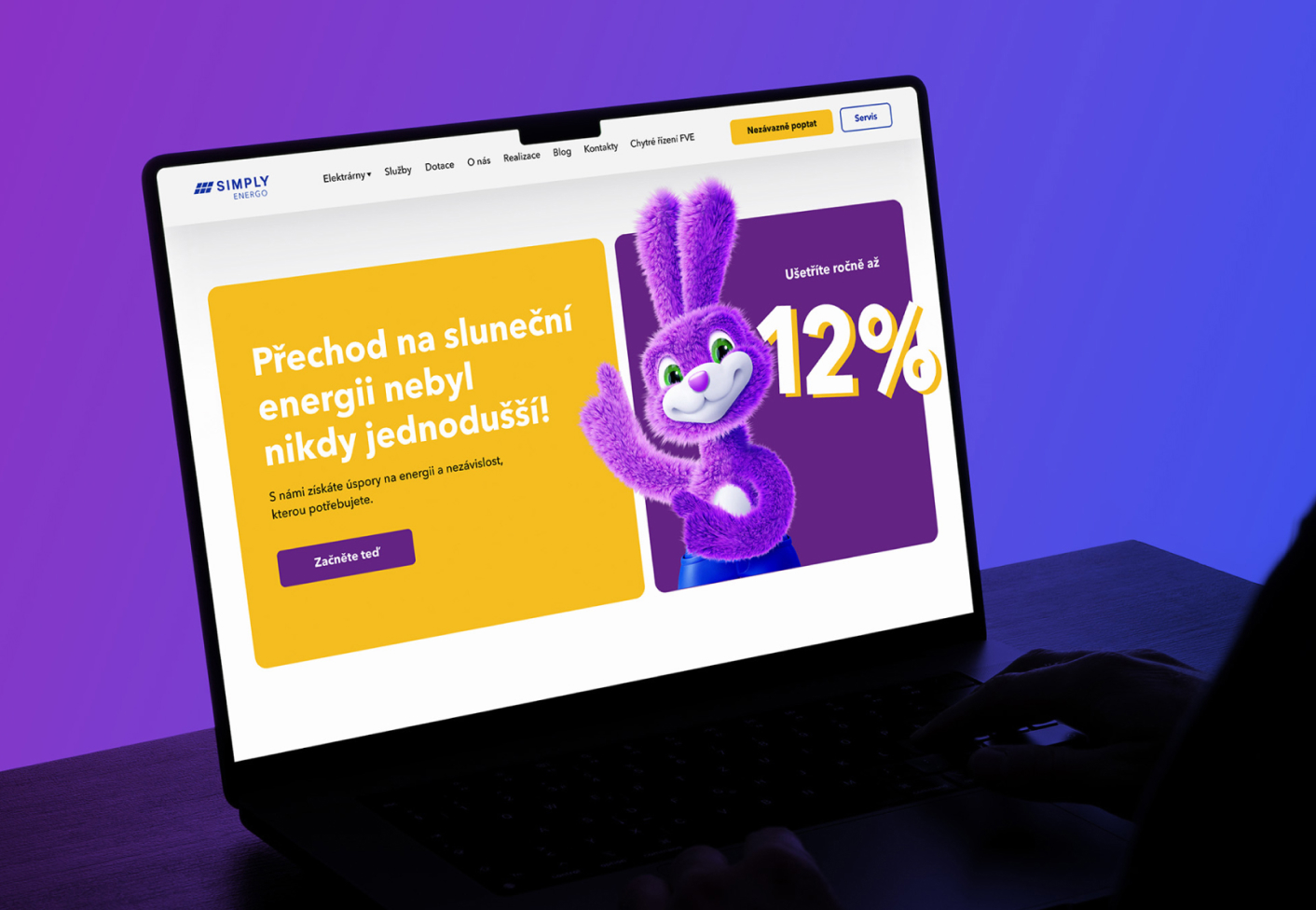
We created a new website that speaks the language of today's world and its customers:
Choosing an energy provider isn't just a technical decision. It’s a matter of trust and convenience. And when everything works as it should, there’s no need to ask questions—everything just falls into place.
Competitor analysis
we reviewed the websites of major market players to understand what really works and to identify opportunities where Simply could stand out.
Understanding users
We focused on the needs of today's customers—those who want clear information, simple decision-making, and a modern online experience.
Structure and user flow
We developed a functional layout that naturally guides users through the site—from their first impression to submitting a form.
Visual direction and style
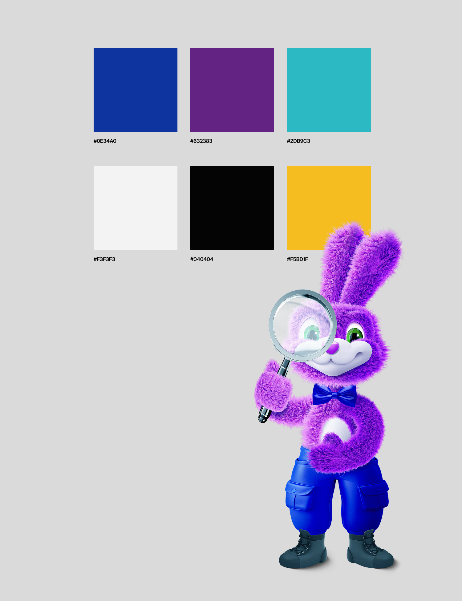
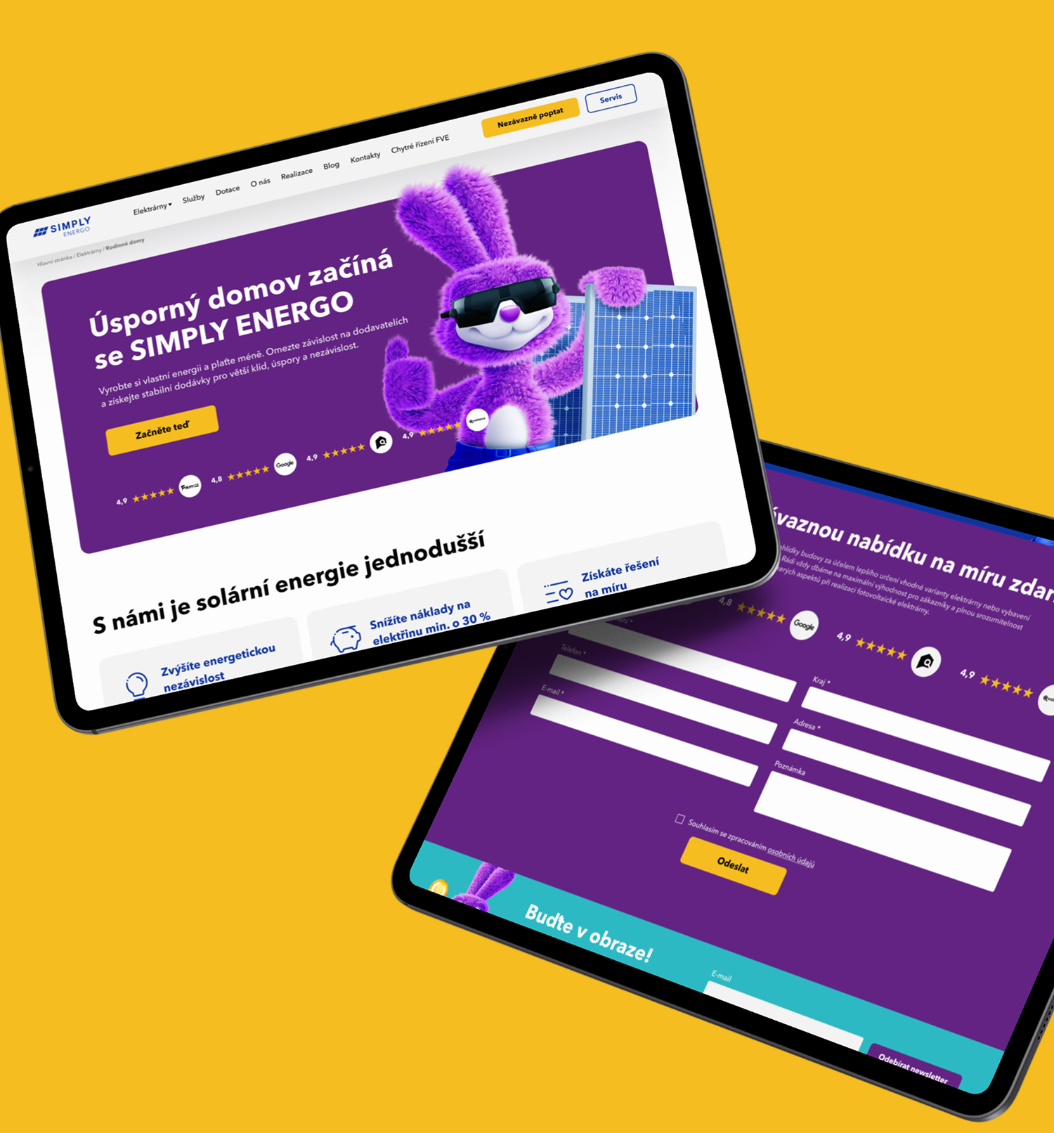
We designed the brand style from the ground up: a new color palette, typography, and use of space, all unified and modern.
Bespoke UI design
Every page has been designed to be clear, attractive, and fully functional.
Fully responsive
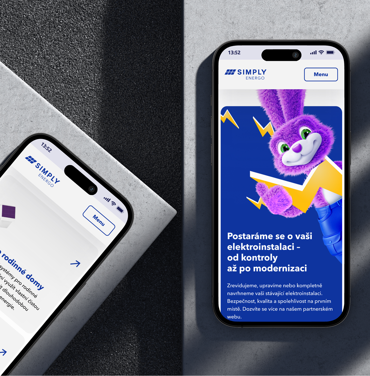
The website works reliably on all devices — from mobile phones to large screens.
3D elements
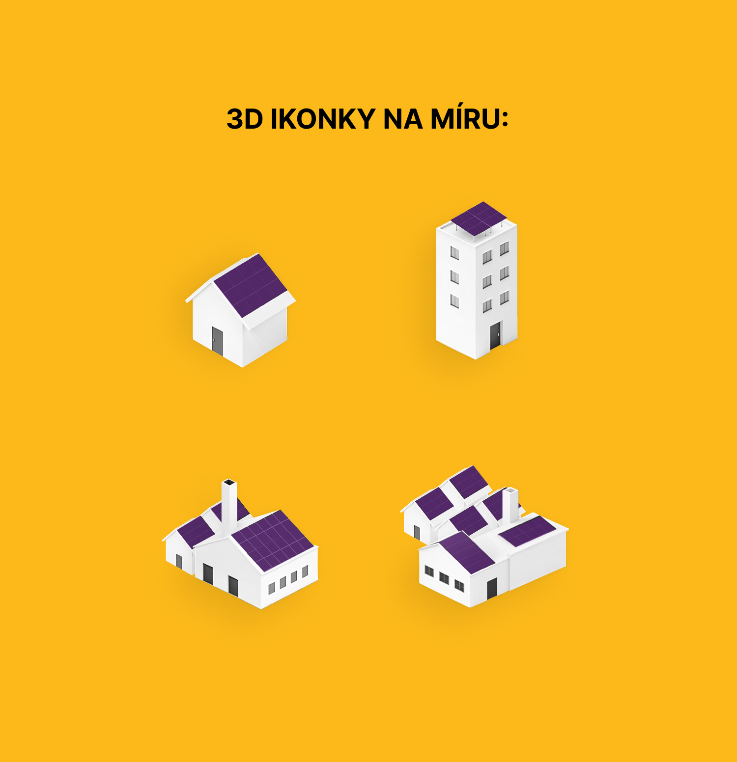
We created a set of original 3D icons and visuals that complement the brand and clarify complex information in the energy sector.