When services overlap, the website has to show how they fit together
Veradon’s overlapping advisory services, finally shown as one clear brand.
- Uitdaging
- Veradon’s services are broad and partly overlap, and the previous presence centered on the founder’s personal brand. Visitors needed to quickly see what Veradon offers, who each service is for and how it all connects, without the site reading like a consulting report.
- Wat we deden
- We mapped the information architecture of the whole site first, then gave each service its own story on a shared foundation. Built in Webflow with 52 reusable components and a CMS, the site lets the client add new pages and content on his own.
- Resultaat
- 100 SEO score in PageSpeed Insights
- 52 components for building new pages, no developer needed
- Under 10 weeks from first design to handoff
Veradon Advisory helps B2B leaders decide how to go to market, where to expand and how to turn strategy into action. Behind it stands founder Phil Tetreault, with more than thirty years of experience from Oracle, SAS and companies of his own. Until now, though, his online presence centered on his personal brand and individual services, not on a cohesive advisory firm. Expirio designed and built a new English-language website for Veradon. It turns an interconnected portfolio into a clear path and positions the brand as an independent, trustworthy partner.
The starting point
Veradon Advisory is the independent advisory practice of founder Phil Tetreault. It supports clients through advisory work, workshops and live discussions on LinkedIn. Everything centers on commercial, growth and execution decisions.
The previous presence was tied closely to the founder's personal brand and to individual advisory services. The information sat in isolated pieces. Nothing showed that one firm, with its own approach and philosophy, stood behind it all.
The challenge
Veradon's portfolio is broad, and the services partly overlap. Yet each one needed its own story and a clearly defined value. Visitors had to grasp three things fast: what Veradon offers, who each service is for and how the services connect.
A lot of interconnected content can easily turn a website into something that reads like a long consulting report. A new brand couldn't afford that. The website also had to present Veradon and its philosophy in a credible, professional way.

Map the whole site first, then the pages
The key decision came right at the start. We didn't begin with individual pages. We began with the information architecture of the entire site and the relationships between the services. Because the services overlap, we needed to see the whole picture first.
On that map, every page got a clear role in the user journey. That's why visitors always know where they are and where to go next. Much of the work went into finding the right hierarchy and pacing the content, so the site reads easily despite its size.
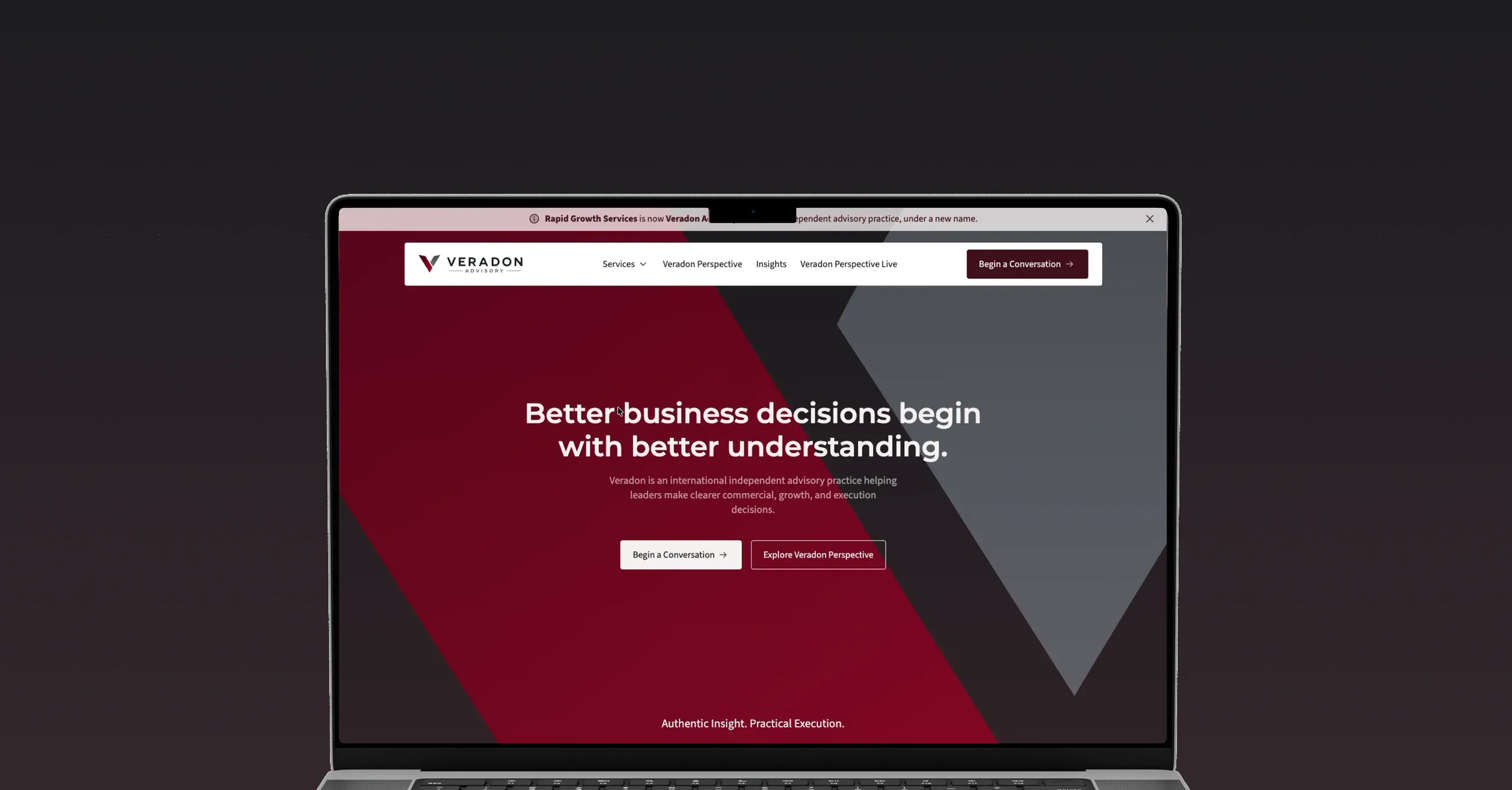
The result shows most clearly on the homepage. It quickly introduces Veradon, its approach and the breadth of its offer, without overwhelming visitors.

Services with a shared foundation and a story of their own
The pages for individual advisory services sit on a repeatable foundation. But we adapted each structure to its content instead of mechanically repeating one template. Every service has its own story and value, yet it's clear they all belong together.
A consistent visual system for typography, color, content and CTAs holds the entire site together. It gives each service room for its own character without letting a large site fall apart. Visually, it's more confident and contemporary than the previous presence, while keeping the seriousness B2B advisory needs.
The site also relies much more on storytelling. A standout element is the Veradon Perspective section. It gives the brand broader context and ties together its values, its way of working and the founder's experience.
A website the client can expand on his own
Most sections, buttons and cards are built from components. The site has 52 of them. With this ready-made library, the client can put together a new page on his own, quickly and safely, without a developer.
Content runs in Webflow CMS, including the Insights and Conversations collections, with 2 CMS templates and 22 items. The most interesting technical piece is an insight that first works as a webinar invitation and later turns into its recording.
Micro-animations on cards and buttons, built with native Webflow interactions, give the site a tactile, dynamic feel. Visitors book a meeting through a TidyCal modal.

The site is live, and the client has filled it with content on his own. He's happy with the result, and we're continuing to work together on the site's further development.
Delen